Trying the Animorphs Font
Written Friday, 1 Mendel, 48 After Tranquility
[Gregorian: Thursday, 22 June, 2017 CE]
We can’t tell you who we are. Or where we live. It’s too risky, and we’ve got to be careful. Really careful. So we don’t trust anyone. Because if they find us… well, we just won’t let them find us. The thing you’ve got to know is that everyone is in really big trouble. Yeah. Even you.
–A message found on the blurb of most Animorphs books. The blurbs, of course, used a more conventional font.
If you want to morph your text, you can get this font here, and discuss it here.
It’s obviously not the best choice for body text, but I’m sure a designer with restraint could make it work. I’m pretty sure this is a fan-created font imitating the one Scholastic made, but it does raise the question of what the people designing the covers were going for.
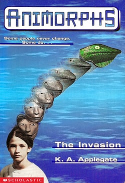
It looks as alien as a font can while still being readable English. It is also fairly distinctive. Anything Animorphs-related could be recognized with a single letter.

Yeah, good luck pulling that off with Helvetica…
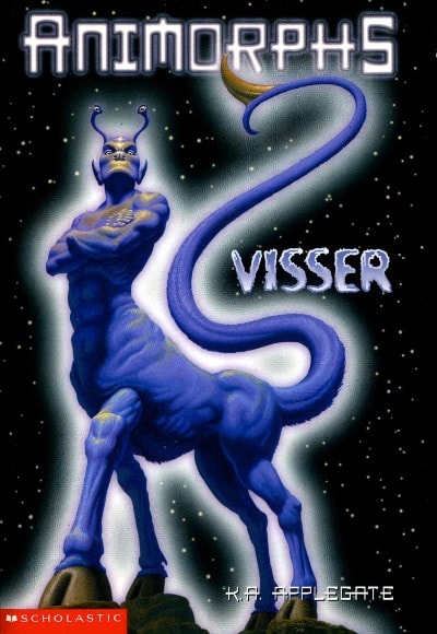
Scholastic actually had other distinct, alien-ish fonts for this series. As you can see, Visser had its own font seperate from the standard Animorphs one (as it deserves … though perhaps that font is used elsewhere). Also notice K.A. Applegate’s name at the bottom: Scholastic at the very least had a significant fraction of the alphabet ready to print in their version of the font, not just the word “Animorphs”. The reprints have their own cover font but I try not to think about them… about the things they have ruined… (the reprint changes are almost purely aesthetic, but none of them are welcome).
As you might have guessed, in the actual content of the books, typography is hardly mentioned. There was just no time. I don’t think they even bash Comic Sans, as the Comic Sans hatedom had not yet escaped their homeworld and spread, like a plague, across the galaxy.